Table of Contents
Over the winter my girlfriend and I got a place together, and I wanted to create a nice map to put up on our wall. I decided to make a project out of it.
Since I started learning about GIS in 2011 I had only read the odd news article or experimented once or twice with QGIS, a free and open source GIS suite. For school and work I had exclusively used ArcMap, so trying out and getting used to the many differences in QGIS was a lot of fun.
The Result
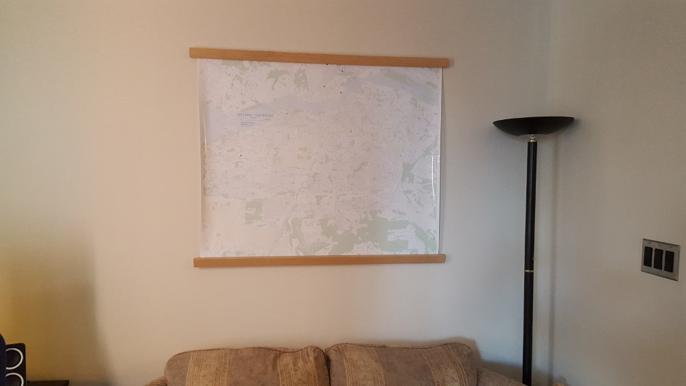
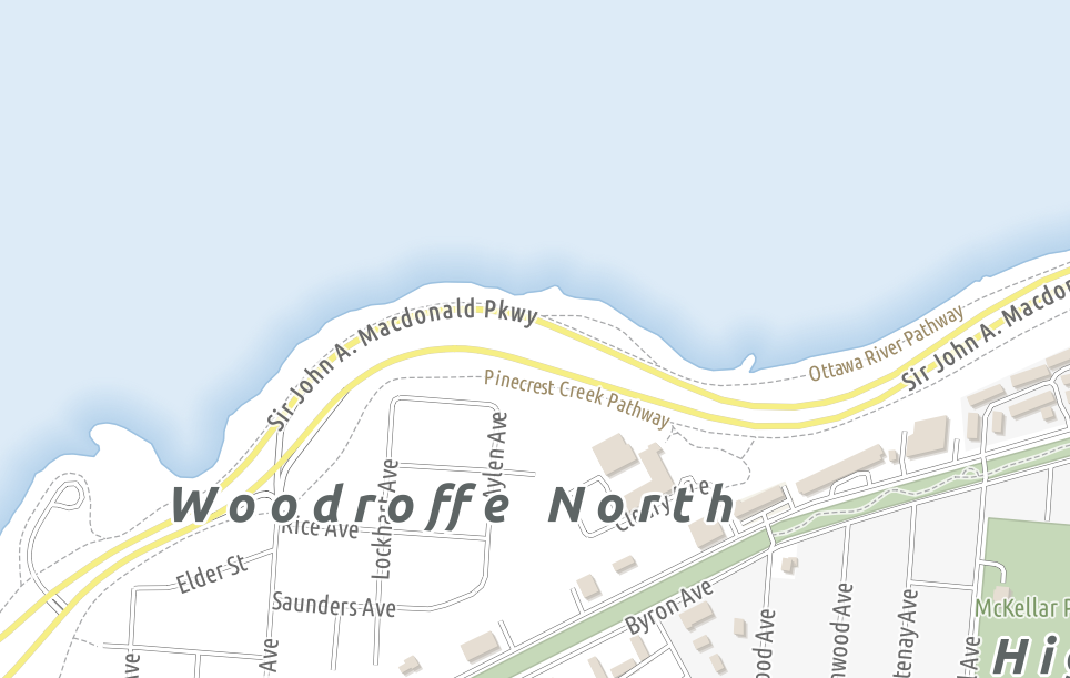
I scaled down the final export and ran it through gdal2tiles, which takes an input image and transforms it into either geo-referenced web mapping tiles, or raw image tiles. It’s displayed below using the OpenLayers web mapping library. You can download the high quality PDF, which can be printed at 42” x 36”, or a lower quality JPEG below.
Download PDF (235 MB) Download JPEG (6 MB)
Printed Version
Pros of using QGIS
Map Units vs Reference Scale
Unlike in ArcMap, where you can set a reference scale for all the layers in your data frame, in QGIS you must symbololize your layers in map units. The conceptual difference is huge, instead of thinking to size my road labels at 6 pts in a 1:20 000 scale data frame, I need to symbolize them to be 15 metres tall at whatever scale I’m viewing them at. After I got used to the idea, it was much easier and intuitive to think of sizing my map symbols in metres rather than points.
Draw Effects
QGIS has support for neat draw effects for most vector symbols in your map, including drop shadows, outer glows, inner glows, and even geometry transformations. You can give an effect to an entire layer, or only to certain parts of a symbol (for example giving an outer glow to just the bottom layer of a multi-layered line symbol). These draw effects render fast, and make it easy to add a bit of flair to your map.
Symbol Editor & Colour Picker
If you’ve ever tried to create complex custom symbology in ArcMap you’ve likely decided to count how many windows you have to click through to change specific options. I think I counted up to six to change the line colour of a leader line for a label. QGIS is much simpler and faster to build symbols, as well as pick and save custom colours.
Cons of using QGIS
My Draw Effects Didn’t Export
While the draw effects I mentioned above are really neat, they’re only useful if they render in the export. I originally planned on using an inner glow effect for the water, similar to the gradient fill symbols I demonstrated in my ArcMap Tips post. These would not render in the QGIS print composer. Creating a new, blank print composer that was significantly smaller in size than my final export fixed this, so I wonder what setting is responsible for this.
Raster Export Bug
I discovered that whenever I tried to export a PDF from print composer with the lat/lon graticule visible it would disable exporting vector shapes and force it to export as a raster. To solve this I ended up exporting as a very high resolution (550 ppi) TIFF image, and doing the post-export touch ups in Photoshop, instead of Illustrator or Inkscape like I had wanted to. I ended up taking the image and processing it at work as editing 2 GB images on my lowly home PC was not a lot of fun. It seems I’m not the only person to have this issue.
Manual Label Placement
If I was able to edit the export in Inkscape or Illustrator this wouldn’t be as big of an issue. The current way to manually adjust labels requires you to create attribute fields (X, Y, and rotation), setting the label placement parameters to be data-defined from those fields, then you are able to move and rotate your labels (only if you’re not using rule-based labelling, as far as I saw). Labelling in QGIS has a lot of potential, and I look forward to it improving in future releases. I may even make it a project to write a simple plugin to help with automating some labelling tasks in the future.
Data Sources
Data for this map was graciously provided by:
- BBBike.Org - OpenStreetMap extracts
- Natural Resources Canada - CanVec 1:50 000 scale vector data
- OpenData Ottawa - For neighbourhood locations, city parks, and airfield outlines
- GitHub - The buildings and some of the land use symbology was taken from this amazing repository
Map Corrections
A nice part about being able to release my work is getting feedback. If or when I ever decide to do a second edition I’d love to fix the errors that are currently present. Please drop me a line in the comments!