Table of Contents
Web GIS today is growing at an exponential pace. Organizations like Google, OSM, MapBox, CartoDB, and of course Esri are providing free and gorgeous basemap tiles that can be used in the browser, as well as inside of desktop GIS applications.
A concequence of using these tiles is that you will usually not be able to perfectly replicate their look and feel when adding your own data on top of these basemaps. Furthermore, the compression artifacts present in many of the tiles often make exporting a professional looking map for print a difficult endeavor.
First, as a disclaimer: I would not consider myself a professional cartographer or designer. I’m simply a GIS guy who has learned a thing or two on my quest to create good looking products for my job. What I’m going to present are a few tips and tricks I use every day that will help your maps look awesome. Many of these points are applicable to both ArcGIS, QGIS, and web mapping, although the primary audience for this post is going to be Esri users.
Colours
Choosing a pleasing and consistent colour scheme becomes harder and harder the more features and layers you add to your map (without it looking like a dogs breakfast, that is). Some of the basic guidelines I follow are:
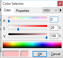
Choose pastel-like, desaturated colours for features that aren’t at the top of the visual heirarchy. This can be easily accomplished by switching to the HSV colour space in the ArcMap color selector. Colours that are softer on the eyes can be made a combination of playing with the brightness (or Value), or decreasing the saturation. Elements at the top of the heirarchy that you would like to pop out to the viewers can be symbolized with more saturated colours.
I never use 100% black on the map. Pure black is very overpowering, and rarely exists in nature. Opt for 90% black at the most - or head into the HSV colourspace again and create a very dark colour instead. The example colour swatches below illustrate the difference a few percent difference in value can make:
For topographic maps, or any map I create that is intended to detail the terrain or geography I reserve the colour blue exclusively for water features. For maps that showcase analysis or thematic data I will usually symbolize the background and any water features as white.
Feature outlines (i.e. road outlines, shorelines, land use, etc.) look very nice when they are set 10%-20% darker than their fill colour. A great example is the OSM Bright CartoCSS style by MapBox.

- Feature outlines can also be set to a neutral colour as pictured here on the road outlines in the Terrain tileset by Stamen to provide a subtle masking effect.

Resources
- Esri Mapping Center - Downloadable style files for pastel, grey shaded, and colourblind friendly colours, as well as hillshade colour ramps.
- Color Brewer - Color advice for thematic maps and chloropleths.
- Adobe Color CC - Generate themes based on different coloring rules.
- Esri Blog - Another overview of colour tools for map makers.
- AxisMaps - Using colors on thematic maps.
Font Choices
The type of, well, type you choose to label your map can affect its look and feel as much as the symbology and colour choices. A map that’s produced for a professional organization will look very different if you use comic sans, compared to a more suitable font (i.e. anything else).
To put it simply, there the two main categories of fonts most often used on your computer, those are Serif, and Sans-Serif fonts.
Serif fonts, such as Times New Roman, and Garamond, are traditionally used for large text blocks (most notably in newspapers), and on more traditional-looking maps that are meant for print, while sans-serif fonts are the predominant font used on electronic displays, including the labels for most popular web maps. Sans-serif can be used in print maps to produce a simpler, cleaner looking map.
The guidelines I follow are:
- If your text or label is placed over top of other features (i.e. a city label appearing over top of roads) ensure that the label has enough [white space](https://en.wikipedia.org/wiki/White_space_(visual_arts)) surrounding it so that it is legible. This can be accomplished in ArcMap by adding a halo, or mask in the text symbol editor. When creating maps using vector data the halos shouldn’t stand out, they should be the same colour as the background in order to give the illusion that the text has space around it. Using halos with colours that contrast with the background can be used to help make the text stand out, which is particularly useful when putting text labels on imagery. The simple maps below illustrate the subtle differences using different colour halos can make.
Water features such as lakes, rivers, and oceans look very nice when labelled by italic fonts.
Line breaks within labels should be avoided whenever possible.
Mixing serif and sans-serif fonts should be avoided - the exception being if one type of font is being used to exclusively label a prominent piece of data or analysis.
Examples

While browsing the map gallery at the 2014 Esri User Conference I was very impressed by the topographic maps produced by the Switzerland Federal Office of Topography (swisstopo). These products showcase the difference between using serif and sans-serif fonts in a map. I highly recommend checking out the story map to explore these products more.
Resources
- Wikipedia - Excellent writeup of different factors that affect labeling.
- TypeBrewer - A Map design tool for selecting typography. Color Brewer for fonts!
- Reddit /r/Typography - Online community dedicated to type.
- Typekit Practice - A collection of resources and a place to practice typography.
- AxisMaps - Labeling and text hierarchy in cartography.
Effective Hillshades
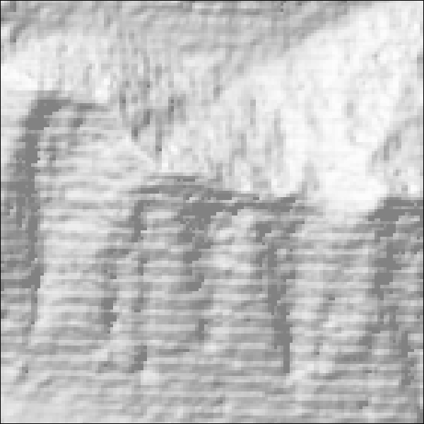
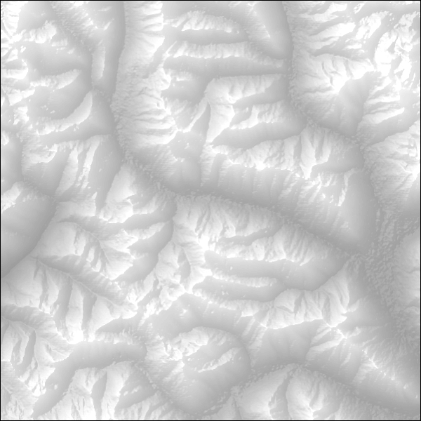
Hillshades, or shaded relief rasters are derived from a DEM, or elevation raster, and are made to simulate the illumination of the terrain. When done properly, hillshades are a subtle way of showing map readers the underlying terrain and relief, without making it the center of attention.
In order to make an efffective hillshade the elevation data you use should be of an adequate spatial resolution. or the hillshade could appear pixelated and blocks.For small scale maps, freely available SRTM elevation data. Elevation data derived from LIDAR can create striking visualizations of smaller areas, if the data is available to you.
There are a few different ways to display a hillshade on your product, and they invariably end up with a different look and feel:
- You could run the
Hillshadetool inArcToobox → Spatial Analyst → Surface - You could select the
Use Hillshade Effectsetting in your elevation rasters layer properties window, which applies a hillshade effect over your elevation raster. - You could add a
Hillshadefunction to its’ function chain
Here are some examples:
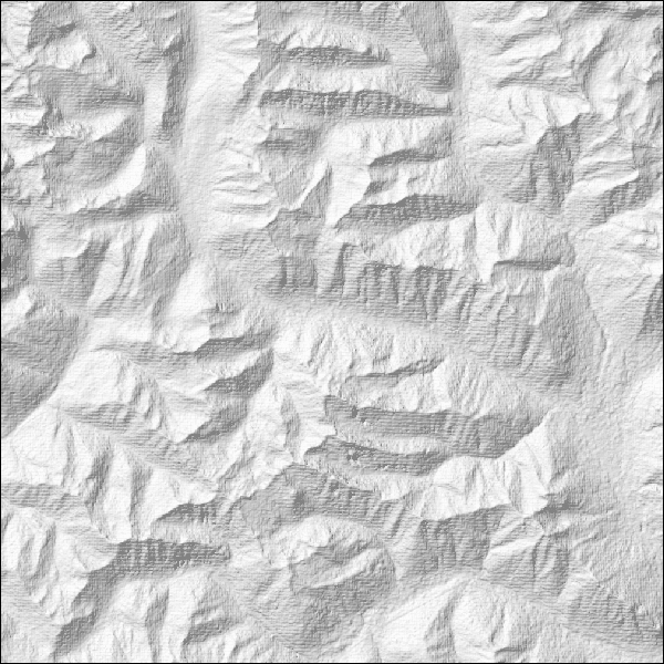
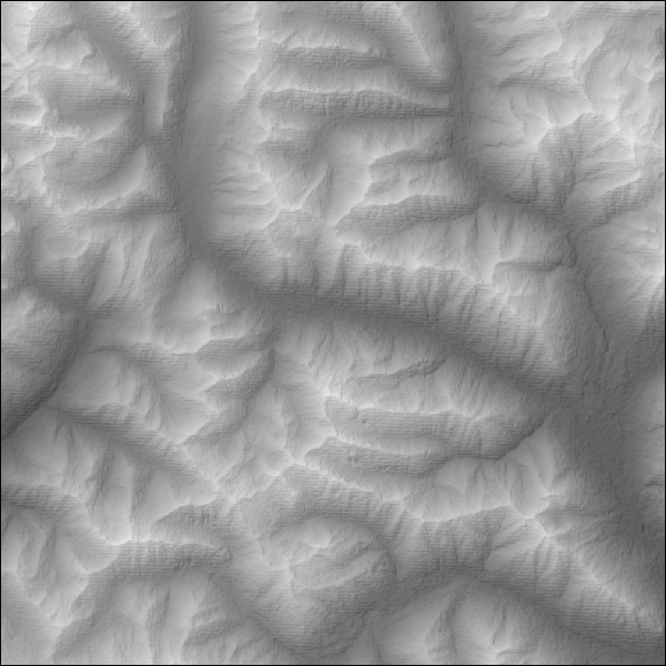
I find the method that results in the best looking hillshade is to run the Hillshade tool, while using carefully chosen
symbology including correct colour ramps and stretch types. Using a combination of elevation raster, hillshade raster,
and curvature rasters, with different transparency levels and colour ramps can easily bring out minute details in terrain.
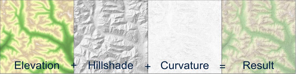
Esri has produced a series of colour ramps made specifically for hillshades and hypsometric tints, and makes choosing a pleasing colour scheme easy. I highly encourage everyone reading this to check out the resources below, as they go much more in depth than I do here, and contain lots of pretty graphics.
Resources
- Esri Blog - Using curvature rasters to enhance terrain representation
- Esri Blog - Understanding curvature rasters
- Esri Blog - Information about creating legends for shaded relief maps
- Esri Blog - Pre-made colour ramps for shaded relief, hypsometric tints, and carto effects
- ShadedRelief.com - In-depth information about shaded relief
- ReliefShading.com - In-depth information about shaded relief
Gradient Fill Symbols
Using gradients to display a smooth transition between colours is another subtle way to separate or highlight features in your map, and can complement other methods such as outlines or borders.
Compare these two graphics of Baffin Island. The second one has a very subtle light blue outer glow effect that was created by applying a gradient fill symbol to a polygon that contains all the water features. A similar effect could be achieved in Photoshop or Illustrator, but using this symbology allows you to make this effect right in ArcMap.


How-To
Please note that increasing the number of intervals can drastically increase the time it takes to render the map. I usually set the intervals to 20 or 25, which is good enough for most uses. My recommendation is to set the symbology then turn the layer off until it’s time to export your map.
Other Examples
The National Geographic Executive world map uses a gradient effect to highlight international borders.
This effect is quite difficult to achieve in ArcMap. Because the distance the gradient goes on each feature is based on a percentage, adjacent polygons that a symbolized like this may not appear the same. As an example if you applied a gradient fill with a distance of 10% to a feature class of countries, your gradient will travel far away from the border of the USA and Canada, while the gradients in the smaller countries in Central America will barely be visible.
The solution to this is to manually set the buffer percentage in the symbology for each feature, or for each group of features that is similarly sized. In the example using countries, you may have to set the buffer percentage to 1.5% for the USA and Canada, 5% for Mexico, and 25% for the smaller countries in order to achieve a consistent effect.
Resources
- Esri Blog - Gradient fills add cartographic allure
Conclusion
I really hope I’ve been able to present some resources that will be useful. I haven’t been able to cover everything I would like to, this post has taken far too long for me to write as it is. I hope to take the feedback I receive from this post and apply it to part two where I hope to cover:
- Complex labelling expressions
- Effectively using maplex
- Location diagrams
Along with a few more subjects I can think of.
Whether you loved or hated this article, I would love to hear your comments!